This page is best read by those pretty familiar with Garry's Mod already. New and junior developers are discouraged from modifying these files without having a proper understanding of not only how Source games handle their files, but also how Garry's Mod itself handles its filesystem. Modifying these files without proper due diligence can break the game in unexpected ways.
Modifying these files are not a part of the addon system which means there are very limited or no safeguards, Before doing anything ensure you have an unedited version of the file you can restore should your edits not be fixable.
What is the SourceScheme File
The SourceScheme.res file found HERE is a Valve KeyValues file that controls the appearance of engine defined VGUI elements. THESE ARE NOT DERMA ELEMENTS meaning we cannot access them through Lua.
Why Customize it?
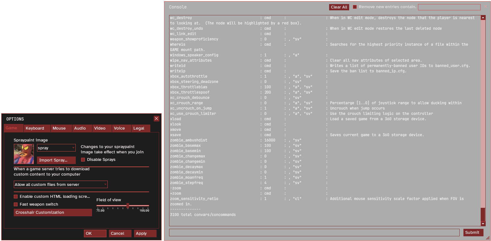
Customizing this file allows you to change the appearance of engine based VGUI panels that are not accessible through regular derma. In this file that includes: Main Menu Options, Console and Loading Dialogue.
The file that comes shipped with the game runs perfectly fine and above all else there is no necessity behind updating or changing this file. However for people who enjoy taking advantage of the open nature of Garry's Mod, this can be customized on the client as seen below.
File Explainer
Colors
The first subsection within the file, this will contain all the color variables that we will use in the following subsection of BaseSettings
The default colors contained within this section are
| RGBA |
Preview |
Name |
255 255 255 255 |
 |
White |
221 221 221 255 |
 |
OffWhite |
190 190 190 255 |
 |
DullWhite |
255 155 0 255 |
 |
Orange |
0 0 0 128 |
 |
TransparentBlack |
0 0 0 255 |
 |
Black |
0 0 0 0 |
 |
Blank |
108 111 114 250 |
 |
GMod_BG_Opaque |
108 111 114 0 |
 |
GMod_BG |
255 255 255 0 |
 |
GMod_WhiteBlank |
157 194 80 255 |
 |
SteamLightGreen |
79 79 79 255 |
 |
AchievementsLightGrey |
55 55 55 255 |
 |
AchievementsDarkGrey |
130 130 130 255 |
 |
AchievementsInactiveFG |
Adding your own colors this key is simple just follow the formatting of the document.
BaseSettings
Here is where you can actually customize the color of the panels.
Because of Garrys Mods progression over time some of these panels are not used anywhere anymore but their remains still exist in this file, I will point out all the values that I could note identify.
Border.Selection "Black"
Border.DarkSolid "40 40 40 255"
Border.Subtle "80 80 80 255"
Button.TextColor "82 82 82 255"
Button.BgColor "227 227 227 255"
Button.ArmedTextColor "46 114 178 255"
Button.ArmedBgColor "240 240 240 255"
Button.DepressedTextColor "White"
Button.DepressedBgColor "84 178 245 255"
CheckButton.TextColor "White"
CheckButton.SelectedTextColor "White"
CheckButton.BgColor "White"
CheckButton.Border1 "Border.Subtle"
CheckButton.Border2 "Border.Subtle"
CheckButton.Check "Black"
CheckButton.DisabledFgColor "Black"
CheckButton.HighlightFgColor "OffWhite"
CheckButton.ArmedBgColor "Blank"
CheckButton.DisabledBgColor "180 180 180 255"
ComboBoxButton.ArrowColor "81 81 81 255"
ComboBoxButton.ArmedArrowColor "110 110 110 255"
ComboBoxButton.BgColor "GMod_WhiteBlank"
ComboBoxButton.DisabledBgColor "GMod_WhiteBlank"
Frame.TitleTextInsetX 16
Frame.ClientInsetX 8
Frame.ClientInsetY 6
Frame.BgColor "GMod_BG_Opaque"
Frame.OutOfFocusBgColor "97 100 102 240"
Frame.FocusTransitionEffectTime "0.3"
Frame.TransitionEffectTime "0.3"
Frame.AutoSnapRange "0"
FrameGrip.Color1 "200 200 200 196"
FrameGrip.Color2 "0 0 0 196"
FrameTitleButton.FgColor "200 200 200 196"
FrameTitleButton.BgColor "GMod_BG"
FrameTitleButton.DisabledFgColor "255 255 255 192"
FrameTitleButton.DisabledBgColor "GMod_BG"
FrameTitleBar.Font "UiBold"
FrameTitleBar.TextColor "255 255 255 204"
FrameTitleBar.BgColor "GMod_BG"
FrameTitleBar.DisabledTextColor "255 255 255 91"
FrameTitleBar.DisabledBgColor "GMod_BG"
FrameSystemButton.FgColor "Blank"
FrameSystemButton.BgColor "Blank"
FrameSystemButton.Icon ""
FrameSystemButton.DisabledIcon ""
Label.TextDullColor "DullWhite"
Label.TextColor "OffWhite"
Label.SelectedTextColor "White"
Label.BgColor "GMod_BG"
Label.DisabledFgColor1 "110 110 110 255"
Label.DisabledFgColor2 "50 50 50 255"
Menu.TextColor "80 80 80 255"
Menu.BgColor "233 233 233 255"
Menu.ArmedTextColor "White"
Menu.ArmedBgColor "132 183 241 255"
Menu.TextInset "6"
Panel.BgColor "108 111 114 0"
ProgressBar.FgColor "White"
ProgressBar.BgColor "TransparentBlack"
PropertySheet.TextColor "10 10 10 200"
PropertySheet.SelectedTextColor "10 10 10 255"
PropertySheet.TransitionEffectTime "0.25"
RichText.TextColor "OffWhite"
RichText.BgColor "TransparentBlack"
RichText.SelectedTextColor "White"
RichText.SelectedBgColor "0 168 255 204"
ScrollBar.Wide 15
ScrollBarButton.FgColor "60 60 60 255"
ScrollBarButton.BgColor "207 207 207 255"
ScrollBarButton.ArmedFgColor "20 65 72 255"
ScrollBarButton.ArmedBgColor "210 237 255 255"
ScrollBarButton.DepressedFgColor "9 119 226 255"
ScrollBarButton.DepressedBgColor "31 207 248 255"
ScrollBarSlider.FgColor "220 220 220 255"
ScrollBarSlider.BgColor "184 184 184 229"
SectionedListPanel.HeaderTextColor "50 50 50 255"
SectionedListPanel.HeaderBgColor "Blank"
SectionedListPanel.DividerColor "0 0 0 150"
SectionedListPanel.BrightTextColor "40 40 40 255"
SectionedListPanel.BgColor "White"
SectionedListPanel.SelectedTextColor "White"
SectionedListPanel.SelectedBgColor "0 168 255 204"
SectionedListPanel.OutOfFocusSelectedTextColor "Black"
SectionedListPanel.OutOfFocusSelectedBgColor "132 183 241 100"
Slider.NobColor "220 220 220 255"
Slider.TextColor "180 180 180 255"
Slider.TrackColor "184 184 184 229"
Slider.DisabledTextColor1 "110 110 110 255"
Slider.DisabledTextColor2 "50 50 50 255"
TextEntry.TextColor "10 10 10 255"
TextEntry.BgColor "White"
TextEntry.CursorColor "10 10 10 255"
TextEntry.DisabledTextColor "128 128 128 255"
TextEntry.DisabledBgColor "192 192 192 255"
TextEntry.SelectedTextColor "10 10 10 255"
TextEntry.SelectedBgColor "0 168 255 204"
TextEntry.OutOfFocusSelectedBgColor "132 183 241 100"
Tooltip.TextColor "110 102 60 255"
Tooltip.BgColor "249 238 181 255"
Console.TextColor "OffWhite"
BitmapFontFiles
Contains a singular special bitmap font used by the UI buttons. Upon further testing i was able to completely remove this section and have things still appear normal.
BitmapFontFiles
{
"Buttons" "materials/vgui/fonts/buttons_32.vbf"
}
Fonts
This is where all the fonts needed to run these engine panels are defined.
Some fields are conditional, indicated by the [$WIN32] or [$X360] Here is the relevant Source 2013 SDK code for how these are elvaluated
It would be overly complex and confusing to try and document all possible locations where each of these fonts are used so instead of bloating this section with the source ill just list a few good notes I had while modifying my copy
Baseline fonts used
- Courier New
- Lucida Console
- Tahoma
- Verdana
- Helvetica Bold
- Marlett (Symbol font idk where its used)
- Trebuchet MS
- FixedSys
- HalfLife2 (Weapon Icons)
Borders
These are basic border definitions for each panel. I personally haven't edited the borders at all so to keep the page short ill just say look at the Original File
Custom Font Files
Loads custom ttf files that are not already in the /fonts subdirectory.
 Garry's Mod
 Rust
Rust
 Steamworks
 Wiki Help